Flutter组件基础
Flutter开发中有一个非常重要的理念,即一切皆为组件。Flutter中Widget不仅可以表示UI元素,也可以布局元素、动画、装饰效果。
Widget不是最终显示在设备屏幕上的显示元素,而是一个描述显示元素的配置数据。Flutter中真正代表屏幕显示元素的类是Element。
在大多数场景下,可以宽泛地认为Widget树就是指UI组件树或UI渲染树。
StatelessWidget表示没有状态的组件,它不需要管理组件的内部状态,也无法使用setState()来改变组件的状态。
对于无状态组件的内部属性,为了防止内部成员变量的值被改变,需要使用final修饰符进行修饰。
创建无状态的组件,需要继承StatelessWidget,并重写build()。
StatefulWidget表示有状态的组件。当创建一个StatefulWidget组件时,同时也会创建一个State对象,StatefulWidget就是通过与State对象进行关联来管理组件状态树的。
创建有状态的组件,需要继承StatefulWidget,然后在该组件中创建状态对象,并重写build()。
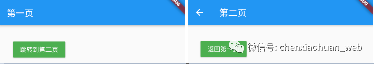
1.3 MaterialApp
MaterialApp是Flutter开发的符合Material设计理念的Widget,可以将它类比为网页开发中的标签,它提供了路由、主题色和标题等功能。
作为Flutter提供的入口Widget,MaterialApp有以下几个比较重要的参数:
1)title:String类型,表示在Android应用管理器的App上方显示的标题,对iOS设备不起作用。
2)home:Widget类型,Flutter应用默认启动后显示的第一个Widget。
3)routes:Map<String, WidgetBuilder>类型,是应用的顶级路由表。
4)theme:定义应用主题。
5)theme.primarySwatch:应用的主题色。
6)theme.primaryColor:单独设置导航栏的背景色。
示例代码:
1
2
3
4
5
6
7
8
9
10
11
12
13
14
15
16
17
18
19
20
21
22
23
24
25
26
27
28
29
30
31
32
33
34
35
36
37
38
39
40
41
42
43
44
45
46
47
48
49
50
51
52
53
54
55
56
57
58
59
60
61
62
| import 'package:flutter/material.dart';
void main() => runApp(MyApp());
class MyApp extends StatelessWidget {
@override
Widget build(BuildContext context) {
return MaterialApp(
title: 'Material Components',
home: FirstPage(),
routes: <String, WidgetBuilder> {
'/first': (BuildContext context) => FirstPage(),
'/second': (BuildContext context) => SecondPage(),
},
initialRoute: '/first',
);
}
}
class FirstPage extends StatelessWidget {
@override
Widget build(BuildContext context) {
return Scaffold(
appBar: AppBar(
title: Text('第一页')
),
body: Padding(
padding: EdgeInsets.all(30.0),
child: MaterialButton(
color: Colors.green,
textColor: Colors.white,
child: Text('跳转到第二页'),
onPressed: () {
Navigator.pushNamed(context, '/second');
},
),
),
);
}
}
class SecondPage extends StatelessWidget {
@override
Widget build(BuildContext context) {
return Scaffold(
appBar: AppBar(
title: Text('第二页')
),
body: Padding(
padding: EdgeInsets.all(30.0),
child: MaterialButton(
color: Colors.green,
textColor: Colors.white,
child: Text('返回第一页'),
onPressed: () {
Navigator.of(context).pop();
},
),
),
);
}
}
|
示例效果:
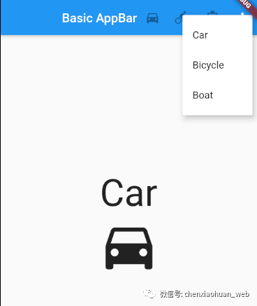
1.4 AppBar
AppBar是Flutter应用的顶部导航栏组件,可以用来控制路由、标题和溢出下拉菜单。
AppBar的基本属性如下:
1)leading:标题左边的图标按钮,默认是一个返回箭头样式的按钮。
2)title:导航栏标题。
3)actions:右边的动作区域中可放置多个组件,可以是图标或者文字。
4)flexibleSpace:位于标题下面的空白空间。
5)bottom:位于导航栏底部的自定义组件。
6)elevation:控制下方阴影栏的坐标。
7)backgroundColor:导航栏的颜色,默认值为ThemeData.primarycolor(主题颜色)。
8)brightness:导航栏材质的亮度。
9)textTheme:文本主题设置。
10)primary:导航栏是否显示在任务栏顶部。
11)centerTitle:标题是否居中显示。
12)titleSpacing:标题的间距。
13)toolbarOpacity:导航栏透明度,1.0表示完全不透明,0.0表示完全透明。
示例代码:
1
2
3
4
5
6
7
8
9
10
11
12
13
14
15
16
17
18
19
20
21
22
23
24
25
26
27
28
29
30
31
32
33
34
35
36
37
38
39
40
41
42
43
44
45
46
47
48
49
50
51
52
53
54
55
56
57
58
59
60
61
62
63
64
65
66
67
68
69
70
71
72
73
74
75
76
77
78
79
80
81
82
83
84
85
| import 'package:flutter/material.dart';
void main() => runApp(AppBarSample());
class AppBarSample extends StatelessWidget {
@override
Widget build(BuildContext context) {
return new MaterialApp(
home: new Scaffold(
appBar: new AppBar(
title: const Text('Basic AppBar'),
centerTitle: true,
actions: <Widget>[
new IconButton(
icon: Icon(choices[0].icon),
onPressed: null,
),
new IconButton(
icon: new Icon(choices[1].icon),
onPressed: null,
),
new IconButton(
icon: new Icon(choices[2].icon),
onPressed: null,
),
new PopupMenuButton<Choice>(
itemBuilder: (BuildContext context) {
return choices.map((Choice choice) {
return new PopupMenuItem<Choice>(
value: choice,
child: new Text(choice.title)
);
}).toList();
},
),
],
),
body: new Padding(
padding: const EdgeInsets.all(16.0),
child: new ChoiceCard(choices[0].title, choices[0].icon),
),
),
);
}
}
class ChoiceCard extends StatelessWidget {
final String title;
final IconData icon;
const ChoiceCard(this.title, this.icon);
@override
Widget build(BuildContext context) {
return Scaffold(
body: Center(
child: Column(
mainAxisAlignment: MainAxisAlignment.center,
children: <Widget>[
Text(
title,
style: TextStyle(
fontSize: 60
),
),
Icon(
icon,
size: 100
),
],
),
),
);
}
}
class Choice {
final String title;
final IconData icon;
const Choice({this.title, this.icon});
}
const List<Choice> choices = const <Choice>[
const Choice(title: 'Car', icon: Icons.directions_car),
const Choice(title: 'Bicycle', icon: Icons.directions_bike),
const Choice(title: 'Boat', icon: Icons.directions_boat),
];
|
示例效果:
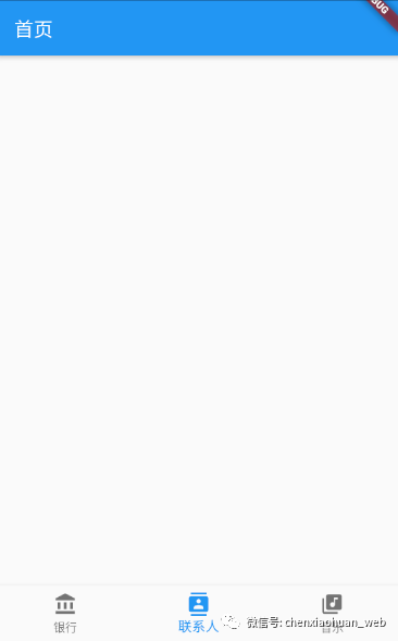
1.5 Scaffold
Scaffold是具有Material布局风格的Widget,它被设计为MaterialApp的顶级容器组件,可以自动填充可用的屏幕空间,占据整个窗口或者设备屏幕。
Scaffold常用的属性:
1)appBar:用于设置顶部的标题栏,不设置就不显示;
2)body:Widget类型,显示Scaffold内容的主要容器。
3)bottomNavigationBar:设置Scaffold的底部导航栏,items的数量必须大于2。
4)drawer:设置抽屉效果。
5)floatingActionButton:设置位于右下角的按钮。
示例代码:
1
2
3
4
5
6
7
8
9
10
11
12
13
14
15
16
17
18
19
20
21
22
23
24
25
26
27
28
29
30
31
32
33
34
| import 'package:flutter/material.dart';
void main() => runApp(ScaffoldSample());
class ScaffoldSample extends StatelessWidget {
@override
Widget build(BuildContext context) {
return MaterialApp(
home: Scaffold(
appBar: AppBar(
title: Text('首页'),
),
bottomNavigationBar: BottomNavigationBar(
type: BottomNavigationBarType.fixed,
currentIndex: 1,
items: [
BottomNavigationBarItem(
icon: Icon(Icons.account_balance),
title: Text('银行'),
),
BottomNavigationBarItem(
icon: Icon(Icons.contacts),
title: Text('联系人'),
),
BottomNavigationBarItem(
icon: Icon(Icons.library_music),
title: Text('音乐'),
),
],
),
),
);
}
}
|
示例效果:
2 状态管理基础知识
在Flutter开发中,Widget状态管理主要分为3种场景,即Widget自身状态管理、子Widget状态管理、父Widget和子Widget都存在的状态管理。
具体选择哪种状态管理,可以参考如下基本原则:
1)如果状态是有关界面外观效果的(如颜色、动画等),最好由Widget自身管理;
2)如果状态是用户数据(如复选框的选中状态、滑块位置等),最好由父Widget管理;
3)如果某一个状态是不同Widget共享的,最好由它们共同的父Widget管理。
2.1 状态生命周期
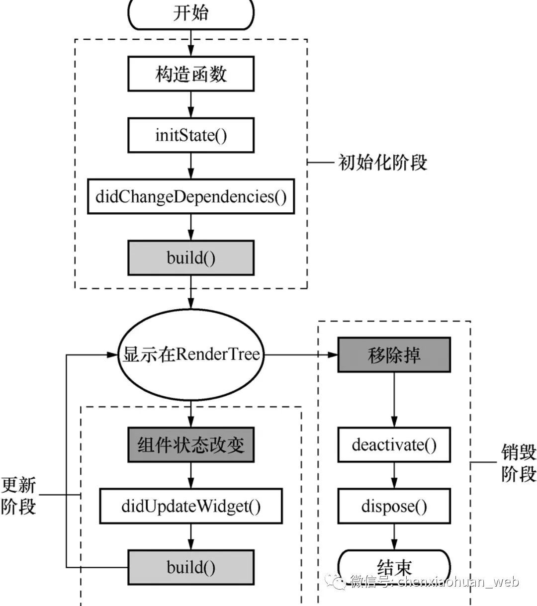
1)初始化阶段
构造函数:生命周期的起点,通过调用createState()来创建一个状态。
initState():在状态组件被插入视图树时调用,在状态组件的生命周期中只被调用一次。
didChangeDependencies():用来处理状态组件依赖关系变化,会在initState()调用结束后被调用。
build():用于构建视图。在build()中,需要根据父Widget传递过来的初始化配置数据及状态组件的当前状态,创建一个Widget然后返回。
2)更新阶段
setState():当状态数据发生变化时,通过调用setState()告诉系统使用更新后数据重构视图。
didChangeDependencies():状态组件的依赖关系发生变化后,Flutter会回调该函数,随后触发组件的构建操作。
didUpdateWidget():当组件的配置发生变化或执行热重载时,系统会回调该函数更新视图。
3)销毁阶段
deactivate():当组件的可见状态发生变化时,deactivate()会被调用,此时状态组件会被暂时从视图树中移除。
dispose():当状态组件需要被永久地从视图树中移除时,调用dispose()。调用dispose()后,组件会被销毁,在调用dispose()之前可以执行资源释放、移除监听、清理环境等工作。
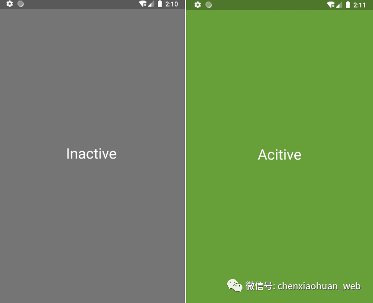
2.2 自身状态管理
改变Widget自身的状态时使用setState(),调用setState()后视图会执行重绘操作。
示例代码:
1
2
3
4
5
6
7
8
9
10
11
12
13
14
15
16
17
18
19
20
21
22
23
24
25
26
27
28
29
30
31
32
33
34
35
36
37
38
39
40
41
| import 'package:flutter/material.dart';
void main() => runApp(TapboxA());
class TapboxA extends StatefulWidget {
@override
State<StatefulWidget> createState() {
return new _TapboxAState();
}
}
class _TapboxAState extends State<TapboxA> {
bool _active = false;
void _handleTap() {
setState(() {
_active = !_active;
});
}
Widget build(BuildContext context) {
return new GestureDetector(
onTap: _handleTap,
child: new Container(
child: new Center(
child: new Text(
_active ? 'Acitive' : 'Inactive',
style: new TextStyle(
fontSize: 32,
color: Colors.white
),
textDirection: TextDirection.ltr,
),
),
width: 200,
height: 200,
decoration: new BoxDecoration(
color: _active ? Colors.lightGreen[700] : Colors.grey[600],
),
),
);
}
}
|
示例效果:
2.3 父子组件状态管理
在此种情况下,子Widget往往是一个无状态的组件,父Widget只需要告诉子Widget何时更新即可。
示例代码:
1
2
3
4
5
6
7
8
9
10
11
12
13
14
15
16
17
18
19
20
21
22
23
24
25
26
27
28
29
30
31
32
33
34
35
36
37
38
39
40
41
42
43
44
45
46
47
48
49
50
51
52
53
54
55
| import 'package:flutter/material.dart';
void main() => runApp(TapboxA());
class TapboxA extends StatefulWidget {
@override
State<StatefulWidget> createState() {
return new _TapboxAState();
}
}
class _TapboxAState extends State<TapboxA> {
bool _active = false;
void _onChanged(bool active) {
setState(() {
_active = active;
});
}
Widget build(BuildContext context) {
return Container(
child: new TapboxB(active: _active, onChanged: _onChanged)
);
}
}
class TapboxB extends StatelessWidget {
final bool active;
final ValueChanged<bool> onChanged;
TapboxB({Key key, this.active: false, @required this.onChanged}): super(key: key);
void _handleTap() {
onChanged(!active);
}
Widget build(BuildContext context) {
return GestureDetector(
onTap: _handleTap,
child: Container(
child: Center(
child: Text(
active ? 'Active' : 'Inactive',
style: new TextStyle(
fontSize: 32,
color: Colors.white
),
textDirection: TextDirection.ltr,
),
),
width: 200,
height: 200,
decoration: new BoxDecoration(
color: active ? Colors.lightGreen[700] : Colors.grey[600],
),
),
);
}
}
|
示例效果:
2.4 混合状态管理
在混合状态管理模式下,子组件自身管理一些内部状态,父组件管理其他外部状态。在此种模式下,子组件使用构造函数接收父组件传递的状态,并使用回调函数返回子组件内部的状态。
示例代码:
1
2
3
4
5
6
7
8
9
10
11
12
13
14
15
16
17
18
19
20
21
22
23
24
25
26
27
28
29
30
31
32
33
34
35
36
37
38
39
40
41
42
43
44
45
46
47
48
49
50
51
52
53
54
55
56
|
import 'package:flutter/material.dart';
class TapboxC extends StatefulWidget {
final bool active;
final ValueChanged<bool> onChanged;
TapboxC({Key key, this.active: false, @required this.onChanged}): super(key: key);
TapboxCState createState() => new TapboxCState();
}
class TapboxCState extends State<TapboxC> {
bool _highlight = false;
void _handleTapDown(TapDownDetails details) {
setState((){
_highlight = true;
});
}
void _handleTapUp(TapUpDetails details) {
setState((){
_highlight = false;
});
}
void _handleTapCancel() {
setState(() {
_highlight = false;
});
}
void _handleTap() {
widget.onChanged(!widget.active);
}
@override
Widget build(BuildContext context) {
return new GestureDetector(
onTapDown: _handleTapDown,
onTapUp: _handleTapUp,
onTap: _handleTap,
onTapCancel: _handleTapCancel,
child: new Container(
child: new Center(
child: new Text(
widget.active ? 'Active' : 'Inactive',
style: new TextStyle(fontSize: 32, color: Colors.white),
textDirection: TextDirection.ltr,
),
),
width: 200,
height: 200,
decoration: new BoxDecoration(
color: widget.active ? Colors.lightGreen[700] : Colors.grey[600],
border: _highlight ? Border.all(color: Colors.teal[700], width: 10) : null,
),
)
);
}
}
|
1
2
3
4
5
6
7
8
9
10
11
12
13
14
15
16
17
18
19
20
21
22
23
24
25
26
27
28
|
import 'package:flutter/material.dart';
import 'TapboxC.dart';
void main() => runApp(ParentWidget());
class ParentWidget extends StatefulWidget {
ParentWidgetState createState() => new ParentWidgetState();
}
class ParentWidgetState extends State<ParentWidget> {
bool _active = false;
void _handleTapboxChanged(bool newValue) {
setState(() {
_active = newValue;
});
}
@override
Widget build(BuildContext context) {
return new Container(
child: new TapboxC(
active: _active,
onChanged: _handleTapboxChanged,
)
);
}
}
|
3 基础组件
3.1 文本组件
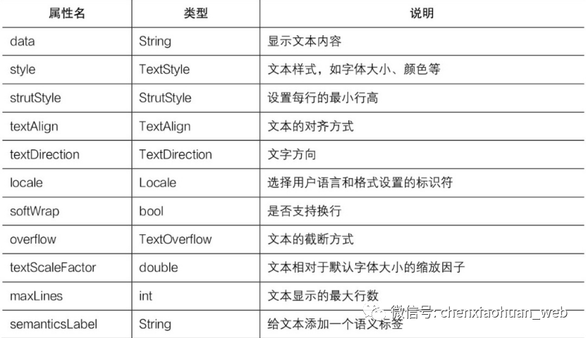
Text组件常见属性:
textAlign属性用于控制文本的对齐方式,取值有6种:
TextAlign.left:左对齐;
TextAlign.right:右对齐;
TextAlign.center:居中对齐;
TextAlign.start:文字开始的方向对齐;
TextAlign.end:文字开始的相反方向对齐;
TextAlign.justify:两端对齐。
textDirection属性用于控制文字的显示方向,取值有2种:
TextDirection.ltr:文字方向从左到右;
TextDirection.rtl:文字方向从右到左。
overflow属性用于表示文本的截断方式,取值有3种:
TextOverflow.ellipsis:多余文本截断后以省略符表示;
TextOverflow.clip:剪切多余文本,多余文本不显示;
TextOverflow.fade:将多余的文本设为透明。
示例代码:
1
2
3
4
5
6
7
8
9
10
11
12
13
14
15
16
17
18
19
20
21
22
23
24
25
26
27
28
29
30
31
32
33
34
35
36
37
38
39
40
41
42
43
44
45
46
47
48
49
50
51
52
53
54
55
| import 'package:flutter/material.dart';
void main() => runApp(TextWidget());
class TextWidget extends StatelessWidget {
@override
Widget build(BuildContext context) {
return new MaterialApp(
title: 'Text组件',
home: new Scaffold(
appBar: new AppBar(
title: new Text('Text组件'),
),
body: Center(
child: Column(
children: <Widget>[
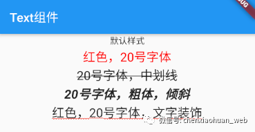
Text('默认样式'),
Text(
'红色,20号字体',
style: TextStyle(
color: const Color(0xffff0000),
fontSize: 20
),
),
Text(
'20号字体,中划线',
style: TextStyle(
decoration: TextDecoration.lineThrough,
fontSize: 20
)
),
Text(
'20号字体,粗体,倾斜',
style: TextStyle(
fontWeight: FontWeight.bold,
fontStyle: FontStyle.italic,
fontSize: 20
)
),
Text(
'红色,20号字体,文字装饰',
style: TextStyle(
decoration: TextDecoration.underline,
decorationColor: Colors.red,
decorationStyle: TextDecorationStyle.wavy,
fontSize: 20
)
)
]
)
),
)
);
}
}
|
示例效果:
除了使用Flutter官方提供的默认字体外,还可以使用第三方字体。使用第三方字体前,需要先在pubspec.yaml配置文件中进行声明,然后使用TextStyle属性引入第三方字体。
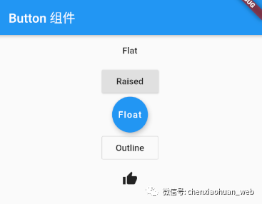
3.2 按钮组件
Materail组件库中常见的按钮组件:
RaisedButton:默认是带有阴影和灰色背景的按钮,按下后阴影会变大;
FlatButton:默认是背景透明并不带阴影的按钮,按下后会有背景色;
OutlineButton:默认是一个带有边框、不带阴影且背景透明的按钮,按下后边框颜色会变亮,同时会出现背景和阴影效果;
IconButton:一个可点击的图标按钮,不支持文字,默认没有背景,点击后会出现背景。
所有Materail组件库的按钮都有两个相同点:一是按下时会有水波动画,另一个是都有一个onPressed属性来设置单击回调。
RaisedButton、FlatButton和OutlineButton等Material按钮组件都有一个图标构造函数,可以使用它来创建带图标的按钮。
按钮组件的常见属性:
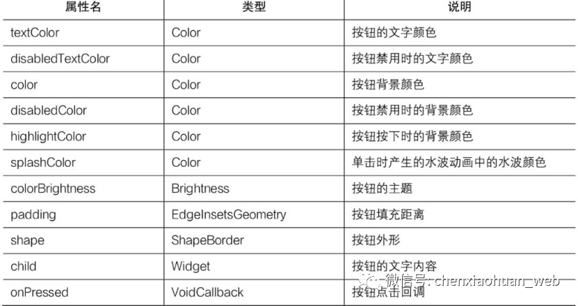
其中onPressed属性是必须的。
示例代码:
1
2
3
4
5
6
7
8
9
10
11
12
13
14
15
16
17
18
19
20
21
22
23
24
25
26
27
28
29
30
31
32
33
34
35
36
37
38
39
40
| import 'package:flutter/material.dart';
void main() => runApp(ButtonWidget());
class ButtonWidget extends StatelessWidget {
@override
Widget build(BuildContext context) {
return MaterialApp(
home: Scaffold(
appBar: AppBar(title: Text('Button 组件')),
body: Center(
child: Column(
children: <Widget>[
FlatButton(
child: Text('Flat'),
onPressed: () => print('FlatButton pressed')
),
RaisedButton(
child: Text('Raised'),
onPressed: () => print('RaisedButton pressed'),
),
FloatingActionButton(
child: Text('Float'),
onPressed: () => print('FloatingActionButton pressed')
),
OutlineButton(
child: Text('Outline'),
onPressed: () => print('OutlineButton pressed')
),
IconButton(
icon: Icon(Icons.thumb_up),
onPressed: () => print('IconButton pressed')
)
]
)
)
)
);
}
}
|
示例效果:
3.3 图片组件
可以使用以下方式来加载不同形式的图片:
Image:通过ImageProvider来加载图片。
Image.asset:用来加载本地的图片。
Image.file:用来加载本地.file文件类型的图片。
Image.network:用来加载网络图片;
Image.memory:用来加载内存缓存的图片。
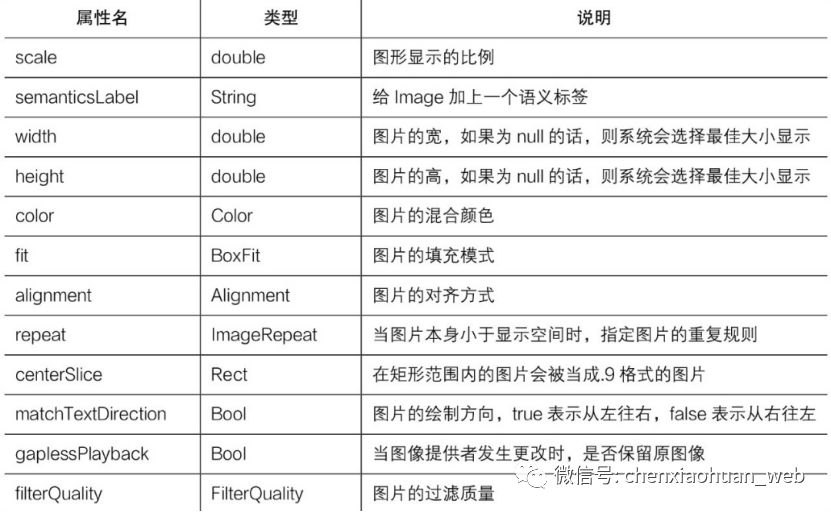
Image组件常见属性:
fit属性用于指定图片的填充模式,取值如下:
BoxFit.fill:全图显示,图片有可能被拉伸,造成图片变形;
BoxFit.contain:全图显示,图片不会变形,超出显示空间的部分会被剪裁;
BoxFit.cover:默认填充规则,在保证长宽比不变的情况下缩放以适应当前显示空间,图片不会变形;
BoxFit.fitWidth:从宽度上充满空间,高度会按比例缩放,图片不会变形,超出显示空间部分会被剪裁;
BoxFit.fitHeight:从高度上充满空间,宽度会按比例缩放,图片不会变形,超出显示空间部分会被剪裁;
BoxFit.scaleDown:与BoxFit.contain的效果差不多,但此属性会缩小图像以确保图像位于显示空间内;
BoxFit.none:没有填充策略,按图片原始大小显示。
示例:加载本地图片
1
2
3
4
5
6
7
8
|
...
flutter:
...
assets:
- images/test.jpg
...
|
1
2
3
4
5
6
7
8
9
10
11
12
13
14
15
16
17
18
19
|
import 'package:flutter/material.dart';
void main() => runApp(ImageWidget());
class ImageWidget extends StatelessWidget {
@override
Widget build(BuildContext context){
return MaterialApp(
home: Scaffold(
appBar: AppBar(title: Text('Image 组件')),
body: Center(
child: Image.asset('images/test.jpg')
)
)
);
}
}
|
示例效果:
3.4 图标组件
常用的图标组件:
IconButton:可交互的Icon组件;
Icons:Flutter自带的Icon组件集合;
IconTheme:Icon组件的主题;
ImageIcon:通过AssetImages或者其他图片显示Icon组件。
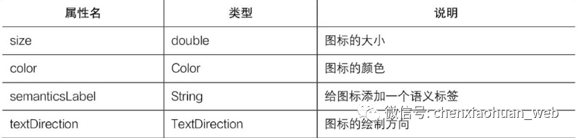
Icon组件常见属性:
Android支持系统自带的图标,mipmap文件中存放的就是Icon类型的图标。
Flutter默认包含了一套Materail Design的字体图标,使用前需要在pubspec.yaml文件中进行如下配置:
1
2
3
4
| ...
flutter:
Uses-material-design: true
...
|
复制
示例代码:
1
2
3
4
5
6
7
8
9
10
11
12
13
14
15
16
17
18
19
20
21
22
23
24
25
26
27
28
| import 'package:flutter/material.dart';
void main() => runApp(IconWidget());
class IconWidget extends StatelessWidget {
@override
Widget build(BuildContext context) {
String icons = '';
icons += '\uE914';
icons += ' \uE000';
icons += ' \uE90D';
return MaterialApp(
title: 'Flutter Demo',
theme: ThemeData(primaryColor: Colors.blue),
home: Scaffold(
appBar: AppBar(title: Text('Icon 组件')),
body: Text(
icons,
style: TextStyle(
fontFamily: 'MaterialIcons',
fontSize: 40,
color: Colors.green
)
)
)
);
}
}
|
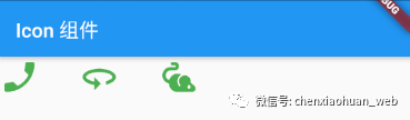
示例效果:
3.5 输入框组件
常见属性:
controller:输入框控制器,通过它可以获取和设置输入框的内容以及监听文本内容的改变。如果没有提供controller,则TextField组件内部会自动创建一个。
focusNode:用于控制TextField组件是否获取输入焦点,它是用户和键盘交互的一种常见方式。
decoration:用于控制TextField组件的外观显示,如提示文本、背景颜色和边框。
textAlign:输入框内文本在水平方向的对齐方式。
textDirection:输入框内文本的方向。
keyboardType:用于设置该输入框默认的键盘输入类型。
textInputAction:回车键为动作按钮图标。
style:输入框的样式。
autofocus:是否自动获取焦点,默认为false。
obscureText:是否隐藏正在编辑的文本内容。
maxLines:输入框文本的最大行数,默认为1.
maxLength:输入框中允许的最大字符数。
onChange:输入框内容改变时的回调函数。
onEditingComplete:输入框输入完成时触发,不会返回输入的内容。
onSubmitted:输入框输入完成时触发,会返回输入的内容。
inputFormatters:指定输入格式,当用户输入的内容发生改变时,会根据指定的格式来进行校验。
enabled:是否禁用输入框。
enableInteractiveSelection:是否启用交互式选择,为true时表示长选中文字,并弹出cut、copy、paste菜单。
keyboardAppearance:设置键盘的亮度模式,只能在iOS上使用。
onTap:TextField组件的点击事件。
buildCounter:自定义InputDecorator.counter小部件的回调实现。
示例代码:
1
2
3
4
5
6
7
8
9
10
11
12
13
14
15
16
17
18
19
20
21
22
23
24
25
26
27
28
29
30
31
32
33
34
35
36
37
38
39
40
41
42
43
44
| import 'package:flutter/material.dart';
void main() => runApp(TextFieldWidget());
class TextFieldWidget extends StatelessWidget {
@override
Widget build(BuildContext context) {
return MaterialApp(
home: Scaffold(
appBar: AppBar(title: Text('TextField 组件')),
body: Column(
children: <Widget>[
TextField(
autofocus: true,
decoration: InputDecoration(
hintText: '请输入用户名或邮箱',
prefixIcon: Icon(Icons.person)
),
onChanged: (v) => print('onChange: $v'),
),
TextField(
decoration: InputDecoration(
hintText: '请输入登录密码',
prefixIcon: Icon(Icons.lock),
),
obscureText: true,
),
SizedBox(height: 15),
Container(
height: 46,
width: 300,
child: RaisedButton(
color: Colors.blue,
textColor: Colors.white,
child: new Text('登录'),
onPressed: () {}
)
)
],
)
)
);
}
}
|
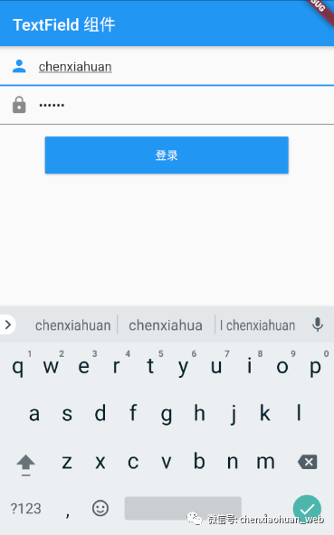
示例效果:
3.6 表单组件
Form是一个包含表单元素的表单组件,可以用来对输入的信息进行校验。表单组件由FormField及其子类构成,最常用的表单组件有DropdownButtonFormField和TextFormField两个。
表单组件是一个有状态的组件,FormState就是表单的状态,可以通过Form.of()或GlobalKey获取组件的状态。
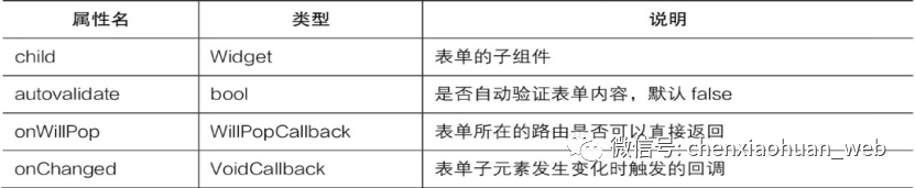
Form组件常见属性:
示例代码:
1
2
3
4
5
6
7
8
9
10
11
12
13
14
15
16
17
18
19
20
21
22
23
24
25
26
27
28
29
30
31
32
33
34
35
36
37
38
39
40
41
42
43
44
45
46
47
48
49
50
51
52
53
54
55
56
57
58
59
60
61
62
63
64
65
| import 'package:flutter/material.dart';
void main() => runApp(FormWidget());
class FormWidget extends StatefulWidget {
@override
State<StatefulWidget> createState() {
return FormWidgetState();
}
}
class FormWidgetState extends State<FormWidget> {
final GlobalKey<FormState> _formKey = GlobalKey<FormState>();
@override
Widget build(BuildContext context) {
return MaterialApp(
title: 'Flutter Demo',
theme: ThemeData(primaryColor: Colors.blue),
home: Scaffold(
appBar: AppBar(title: Text('Form 组件')),
body: Form(
key: _formKey,
child: Column(
children: <Widget>[
TextFormField(
decoration: InputDecoration(
hintText: '用户名',
icon: Icon(Icons.person)
),
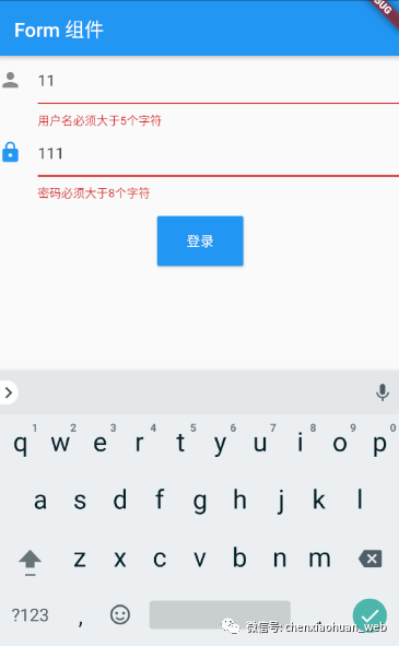
validator: (value) {
if(value.length <= 5) {
return '用户名必须大于5个字符';
}
},
),
TextFormField(
decoration: InputDecoration(
hintText: '密码',
icon: Icon(Icons.lock)
),
validator: (value) {
if(value.length <= 8) {
return '密码必须大于8个字符';
}
},
),
SizedBox(height: 15),
RaisedButton(
padding: EdgeInsets.all(15),
child: Text('登录'),
color: Theme.of(context).primaryColor,
textColor: Colors.white,
onPressed: () {
if(_formKey.currentState.validate()) {
_formKey.currentState.save();
}
},
)
],
)
)
)
);
}
}
|
示例效果:
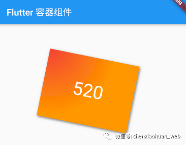
4.4 容器组件
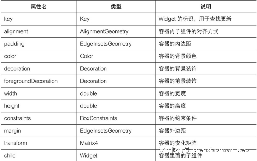
Container是Flutter提供的容器组件,可以包含一个子组件,常用的属性如下:
示例代码:
1
2
3
4
5
6
7
8
9
10
11
12
13
14
15
16
17
18
19
20
21
22
23
24
25
26
27
28
29
30
31
32
33
34
35
36
37
38
39
| import 'package:flutter/material.dart';
void main() => runApp(ContainerWidget());
class ContainerWidget extends StatelessWidget {
@override
Widget build(BuildContext context) {
return MaterialApp(
title: 'Flutter 容器组件',
home: Scaffold(
appBar: AppBar(title: Text('Flutter 容器组件')),
body: Container(
margin: EdgeInsets.only(top: 30, left: 120),
constraints: BoxConstraints.tightFor(width: 200, height: 150),
decoration: BoxDecoration(
gradient: RadialGradient(
colors: [Colors.red, Colors.orange],
center: Alignment.topLeft,
radius: .98
),
boxShadow: [
BoxShadow(
color: Colors.black54,
offset: Offset(2, 2),
blurRadius: 4
)
]
),
transform: Matrix4.rotationZ(.2),
alignment: Alignment.center,
child: Text(
'520',
style: TextStyle(fontSize: 40, color: Colors.white),
),
)
)
);
}
}
|
示例效果: